

Blog
Newsletter Signup Accessibility Tips That Work

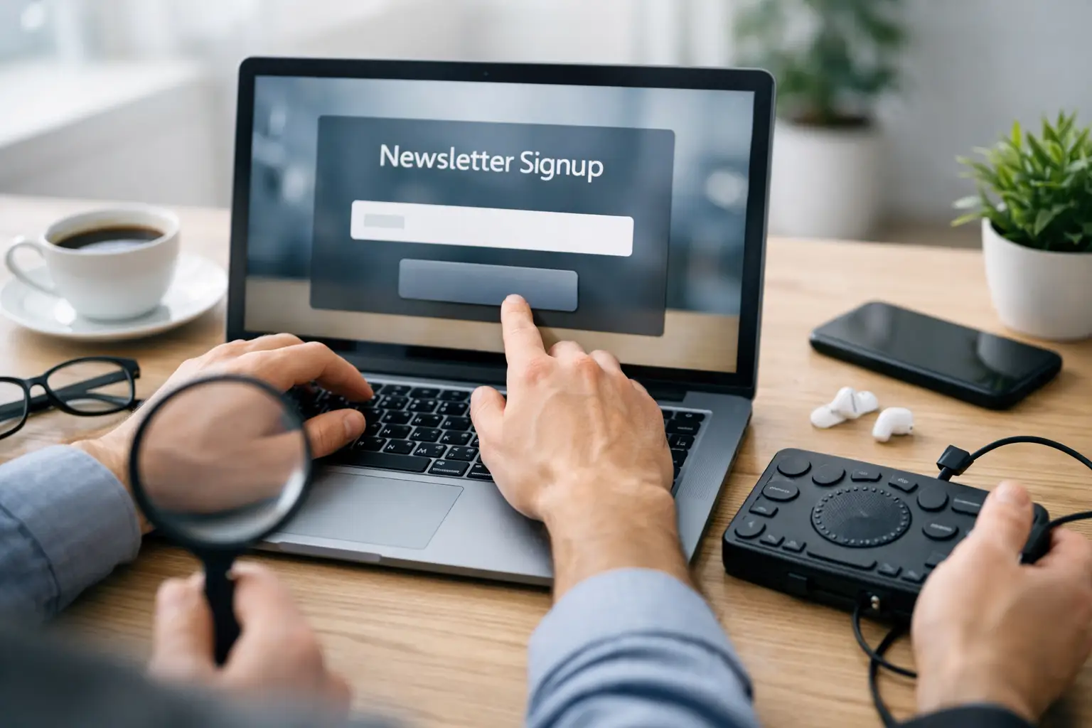
A newsletter form can look complete and still exclude the people it is meant to reach. A visitor may want updates on vehicles, motors, equipment, or future announcements, but leave if they cannot identify a field, use a keyboard, or understand why a submission failed. These newsletter signup accessibility tips focus on the small form decisions that let more people subscribe independently.
For a developing website, the signup form is often one of the first direct ways to build an audience. It should be treated as a working communication tool, not a decorative footer element. Clear instructions, predictable controls, and honest consent language make the form easier for everyone, including people using screen readers, voice control, screen magnification, or a mobile device.
Start with a clear purpose
Place a short explanation directly above the form. Visitors should know what they will receive and how often. “Get occasional updates about new inventory and service news” is more useful than a button that simply says “Subscribe.” If the newsletter has not been defined yet, use a modest promise rather than vague marketing language: “Sign up for future news and announcements.”
This context also helps people decide whether the form is worth their attention. Do not hide the purpose in placeholder text inside the email field. Placeholder text disappears once someone starts typing, can be hard to read, and is not a replacement for a visible label.
A brief privacy statement is helpful when email addresses are collected. State what will happen to the address in plain language. If email addresses will be used only for updates, say so. Avoid making visitors search through another page to learn whether they are agreeing to promotions, partner messages, or unrelated contact.
Newsletter signup accessibility tips for form fields
A reliable form starts with the label. Each input needs a visible label that stays on screen when the field has content. For an email field, “Email address” is direct and familiar. A screen reader must also be able to programmatically associate that label with the correct field.
Do not rely on an asterisk by itself to show that a field is required. Write “Email address (required)” or place a short note above the form explaining which fields are required. If a required field is left blank, the error message should identify the field and tell the visitor what to do next.
Keep the number of fields low. An email address may be all that is necessary for a basic newsletter. Asking for a first name can support personalization, but it should be optional unless there is a clear reason it is required. Every extra field adds effort, introduces another possible error, and can discourage signups.
Use the appropriate input type for email addresses so mobile devices offer a more useful keyboard. Do not impose unnecessary formatting rules. A subscriber should not have to remove spaces from a name or meet arbitrary password-style requirements just to receive updates.
Make instructions visible before errors happen
If a field has a specific requirement, state it before the visitor submits the form. For example, explain that a ZIP code is needed only if updates are location-specific. If a checkbox is required for consent, explain what the person is consenting to beside the checkbox itself.
Instructions should not depend on color alone. Text that turns red without an accompanying message can be missed by people with color-vision differences and may not be communicated clearly by assistive technology. Use clear words, an icon if appropriate, and sufficient color contrast.
Make keyboard use easy and predictable
Many people complete web forms without a mouse. They may use a keyboard, switch device, voice command, or other assistive technology. A visitor should be able to reach every field, checkbox, and submit button using the Tab key in a logical order.
Avoid custom controls that look polished but cannot be operated with standard keyboard commands. Native form fields are often the safer choice because browsers and assistive technologies already understand how they work. A custom design may be appropriate when it solves a real need, but it must be tested more carefully.
The keyboard focus indicator must remain visible. When someone tabs into an email field or button, there should be a clear outline, border, or other visual change that shows where they are. Removing the browser’s default focus outline without providing an equally visible alternative leaves keyboard users guessing.
A form should also avoid focus traps. After opening a consent panel or error message, users need a straightforward way to continue or return to the form. If a confirmation message appears after submission, move focus to it when appropriate so screen reader users know the action succeeded.
Write errors that help people recover
Generic messages such as “Invalid input” are frustrating because they do not identify the problem. A useful message says what happened and how to fix it: “Enter an email address in the format name@example.com.” Place the message near the relevant field and make sure assistive technology announces it.
If several fields have errors, show a short error summary near the top of the form as well as messages beside each field. The summary should identify the fields that need attention. This is especially useful on mobile screens, where the first error may not be visible after submission.
Do not erase information a visitor already entered after an error. Requiring someone to retype their name or check a consent box again creates needless friction. Preserve valid entries and return the user to the first field that needs correction.
Success messages deserve the same care. “Thanks for subscribing” is a start, but it may not be enough if a confirmation email is required. Say what happens next: “Check your inbox to confirm your subscription.” If messages can take a few minutes to arrive, mention that without making promises that cannot be kept.
Build consent choices people can understand
Newsletter signups should use specific, readable consent language. A checkbox labeled “I agree” does not tell a visitor what they are agreeing to. Instead, use wording such as “I agree to receive email updates and announcements.” If there are separate categories, such as product news and event notices, offer separate choices.
Pre-checked marketing boxes are a poor fit for both clarity and trust. Let visitors make the choice themselves. This is not only more respectful, but it also reduces the chance of collecting subscribers who did not intend to sign up.
A double opt-in process can be useful when the priority is list quality and clear confirmation. It adds one more step, so it may reduce the total number of completed subscriptions. For a new or lightly used list, that trade-off can be worthwhile because it confirms that the address belongs to the person who submitted it.
Check contrast, spacing, and mobile behavior
Accessible forms need readable text and controls that are easy to touch. Light gray text on a white background may look understated but can be difficult to read. Labels, helper text, error messages, and button text all need sufficient contrast against their backgrounds.
Buttons and checkboxes should have enough space around them to be selected accurately on a phone. A tiny checkbox next to a long consent statement is difficult for many users. Increase the tap area without separating the checkbox so far from its label that the relationship becomes unclear.
Do not use a color change as the only indication of focus, error, or completion. Shape, text, borders, and icons can provide additional cues. Also test the form when the browser zoom is increased. Content should reflow without forcing visitors to scroll sideways or lose access to the submit button.
For a site like Bonded Motor, a simple form with an email field, clear consent wording, and a readable submit button is usually more effective than a heavily styled widget. The best design depends on the site’s future audience and email strategy, but the basic experience should remain understandable without specialized knowledge.
Test the form before promoting it
Testing does not need to begin with expensive tools. Complete the form using only a keyboard. Check whether every control receives visible focus, whether the order makes sense, and whether the submission can be completed without a mouse. Then test it on a phone with larger text enabled.
Use a screen reader when possible, or ask someone familiar with assistive technology to review the experience. Listen for whether labels are announced, required fields are identified, error messages are read, and success feedback is clear. Automated accessibility checks can find some technical issues, but they cannot judge whether the instructions make sense.
Finally, revisit the form after updates to the theme, newsletter plugin, or consent settings. A change that appears minor can remove labels, alter focus behavior, or create an unreadable error message. A signup form earns trust one interaction at a time, and a visitor who can use it without barriers is more likely to stay connected.
One thought on “Newsletter Signup Accessibility Tips That Work”